Corporate typography: the key to improving the perception and success of your brand. How to choose the right typography for your brand?
Corporate typography is the typeface that a brand chooses to use in its graphic representations, both physical and digital. It is just as important an element as the graphics, logo and brand colours. Corporate typography is not only about good looks, it is also about legibility and brand personality. In this blog, I'll explain everything you need to know about corporate typography and how to choose the right one for your business.
What is corporate typography and what are its functions?
Corporate typography is the typeface a company uses to represent its brand. Corporate typography is an important part of a company's visual identity and is used in all communication materials, from the logo to marketing and advertising documents. Corporate typography has several important functions, including:
- Representing the brand's personality: Corporate typography should reflect the brand's personality and convey its message effectively. For example, a company that sells children's products may use a more fun and playful typeface, while a financial services company may use a more serious and professional typeface.
- Improve legibility: Corporate typography should be easy to read and understand. Poorly designed or hard-to-read typography can negatively affect brand perception.
- Create consistency: Corporate typography helps to create consistency across all company communication materials. By using the same typography on all communication materials, a consistent and recognisable brand image is created.
What are the benefits of having a visual identity manual that aids the use of our typefaces?
Corporate typography is used to represent a company's brand and convey its message effectively. Having the right typography with the brand personality has several benefits, such as:
- Improves brand perception: The right typography can improve brand perception and make it more appealing to customers.
- Creates a consistent image: By using the same typography in all communication materials, a consistent and recognisable brand image is created.
- Easy to read: The right typography is easy to read and understand, making the company's communication materials easier to read.
- Conveys brand personality: The right typography can convey a brand's personality and make it more memorable to customers.
A visual identity manual is a guide that sets guidelines for the use of corporate typography and other visual elements of the brand. A visual identity manual helps ensure that the brand is represented consistently across all communication materials.
Why is it so important to choose the right typeface to match the personality of each brand?
The right typography is important because it helps to convey brand personality and improve brand perception. Poorly designed or difficult to read typography can negatively affect brand perception. On the other hand, the right typography can improve brand perception and make the brand more appealing to customers.
And if we don't take it into account, what could happen?
If the right typography is not taken into account, it can negatively affect the perception of the brand and make it less attractive to customers. Companies that are successful despite using inappropriate typefaces or many different typefaces may be the exception rather than the norm. This may be due to a variety of factors, such as the quality of their products or services, their price, their location, etc. In general, it is important to use the right typography to improve brand perception and make your brand more attractive to customers.
Types of typefaces
There are many types of typefaces, but they can be broadly classified into four main categories: serif, sans serif, display, and script.
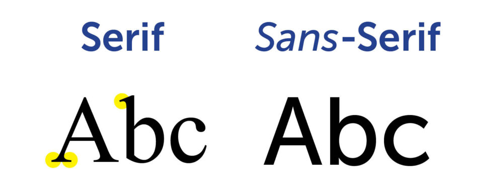
Serif typefaces are those that have small strokes or extensions at the end of the main strokes of the letters, such as Times New Roman, Garamond, or Baskerville. Serif typefaces are often associated with tradition, elegance, and authority, and they are commonly used for books, newspapers, and magazines. Serif typefaces can also enhance the readability of text, as the serifs help guide the eye along the lines of text.
Sans Serif typefaces are those that do not have serifs, such as Arial, Helvetica, or Futura. Sans Serif typefaces are often associated with modernity, simplicity, and clarity, and they are commonly used for logos, headlines, and web design. Sans Serif typefaces can also create a sense of spaciousness and minimalism, as they have less visual clutter than serif typefaces.
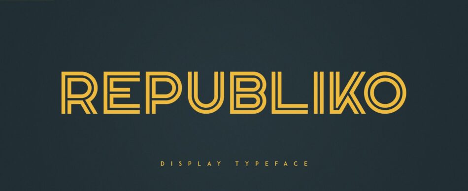
Display typefaces are those that are designed for large sizes and decorative purposes, such as Comic Sans, Impact, or Bauhaus. Display typefaces are often associated with creativity, fun, and personality, and they are commonly used for posters, banners, and logos. Display typefaces can also attract attention and convey a specific mood or tone, as they have distinctive and expressive features.
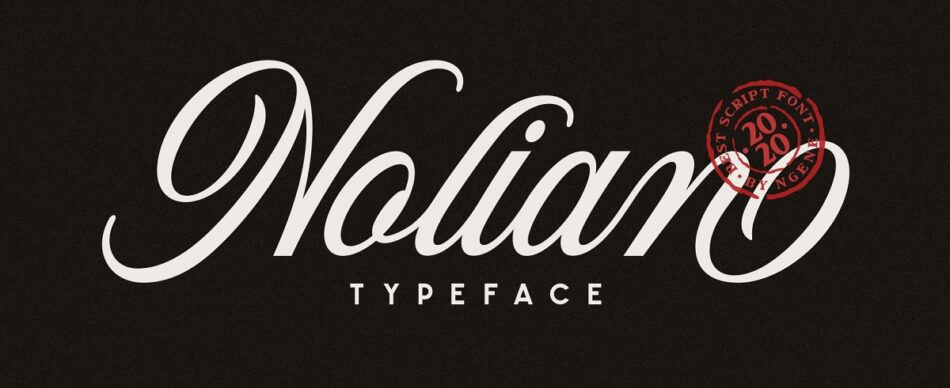
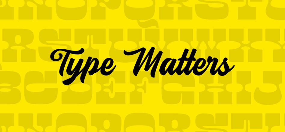
Script typefaces are those that mimic handwriting or calligraphy, such as Lucida Handwriting, Brush Script, or Zapfino. Script typefaces are often associated with elegance, romance, and sophistication, and they are commonly used for invitations, certificates, and signatures. Script typefaces can also create a sense of warmth and intimacy, as they have fluid and organic shapes.
These are the main types of typefaces, but there are also many subtypes and variations within each category. The choice of typeface depends on the purpose, audience, and message of the document or the brand, and it can have a significant effect on the perception and impression of the reader or the consumer. Therefore, it is important to understand the different types of typefaces and how to use them effectively.
Case studies
Here are some case studies of companies that have used corporate typography effectively:
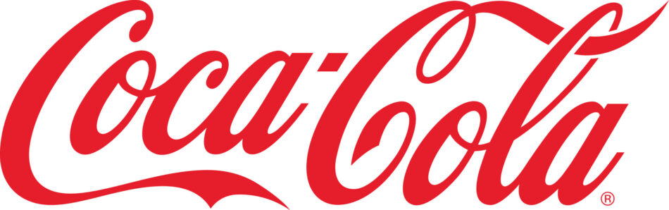
Coca-Cola:
Coca-Cola is one of the most recognised brands in the world. Coca-Cola's corporate typeface is one of the most iconic and has been used since 1887. The typeface used by Coca-Cola is a custom font called "Spencerian Script". This font is used on all of the company's communication materials and is easily recognisable to consumers.
Apple
Apple is another company that has used corporate typography effectively. The typeface used by Apple is a custom font called "San Francisco". This font is used on all Apple products and is easily recognisable by consumers. Apple's typeface is simple and elegant, reflecting the company's design philosophy.
FedEx
FedEx is a courier and parcel service company that has used the corporate typeface effectively. The typeface used by FedEx is a custom font called "FedEx Sans". This font is used in all of the company's communication materials and is easily recognisable to consumers. The FedEx typeface is simple and modern, reflecting the company's philosophy.
How do you choose a corporate typeface ?
Choosing the right corporate typeface can be a complicated process. It is important to consider several factors, such as brand personality, legibility and consistency. A professional brand designer can help choose the right typeface for a company and ensure that it is used effectively across all communication materials.
What materials and resources can help to understand it?
There are several resources available online that can help in understanding corporate typography. Some of these resources include:
- Blog articles: There are many blog articles available online like this one you are reading that explain the importance of corporate typography and how to choose the right one for a company. If you are interested in learning more about typography or design, I invite you to subscribe to my newsletter.
- Educational videos: There are many educational videos available online that explain corporate typography and how to choose the right one for a company.
- Visual identity manuals: Visual identity manuals are guides that set out guidelines for the use of corporate typography and other visual brand elements. These manuals can help ensure that the brand is represented consistently across all communication materials.
In conclusion, corporate typography is an important element of a company's visual identity and is used in all communication materials, from the logo to marketing and advertising documents. Choosing the right typography can be a determining factor in a company's success. The right typography can improve the perception of the brand and make it more attractive to customers. On the other hand, poorly designed or difficult to read typography can negatively affect brand perception.
I hope this blog has been useful to you and has provided you with valuable information about corporate typography. If you are interested in getting more information like this I suggest you follow me on my social networks or subscribe to my newsletter for more informative content.
It's time to transform your brand. Make it happen !
Subscribe to my newsletter !
Subscribe to my newsletter and be the first to receive my free "5 Fundamental Steps to Naming a Company and Product" when it is ready. And also receive regular updates on my latest publications, news and offers.